| 揭阳市华洋电子实业有限公司
|
|
 |
|
|
|
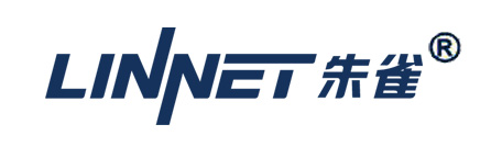
“LINNET” brand system was visualized by the following basic design factors, English logo, Chinese logo and logo standard color.
We strived to define the logo“LINNET” which can represent high quality and best basic platform through all design ideation. “LINNET” not only supplys computer peripheral equipment for domestic market but also for overseas market. In this case, when we make this design of “LINNET”, we need to focus on how to identify the brand easily and make it more practicable. Moreover, this logo must pass our brand information visually and the brand memory should be enhanced at the same time.
We try hard for attaining on the technique of expression simple and direct but remarkable, according to the processing toward the writing center "N", it makes marking full of variety in a unifyed design encreased brand in the layer feeling on the sense of vision; Secondly, overstriking font of written strengthen our brand's steady reliant sense; Thirdly, the writing led a horny processing body shows brand connotation being affinity and humanize.
Finally, we incline the logo for incarnating speed and the company's enterprising spirit, and making the logo more fashionable.
|
|
|
|
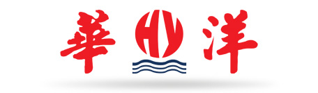
Dark red, national color of the Chinese people, is the most characteristic color in Chinese culture. It symbolizes enthusiasm, bravery and vigor and embodies the corporate orientation of professionalism, vigor, creativity and high-tech. This color, traditionally linking with happiness and luck, also increases the affinity with the corporate image.
Dark blue, the color of acceptance and cohesion in science and technology, adds a touch of class and dignity. The combination of red and blue signifies stability, harmony and prosperity.
The logo of Huayang Company is the image of the legendary bird of ZHUQUE, which is the guardian of the people and brings good health and fortune. Now in the wonderful virtual modern world, it plays a part as a network angle. The products of the company will be the guardian angel of our consumer. The trade mark comes with the shape of a flying ZHUQUE, along with the combination of brand name in Chinese and English. It shows our high expectation and determination to make the brand bigger, better and stronger.
|
|
|
|
|